Creativity is Key to living life to the full. Join me, find out how you can too. I will post about my creative exploits with some great hints and tips on how you too can create a wonderful life through creativity. I hope that through seeing what I get up to in a creative way will inspire you to do the same. Creativity is a great way to begin to find ways to have a wonderful life. Take care and Enjoy.
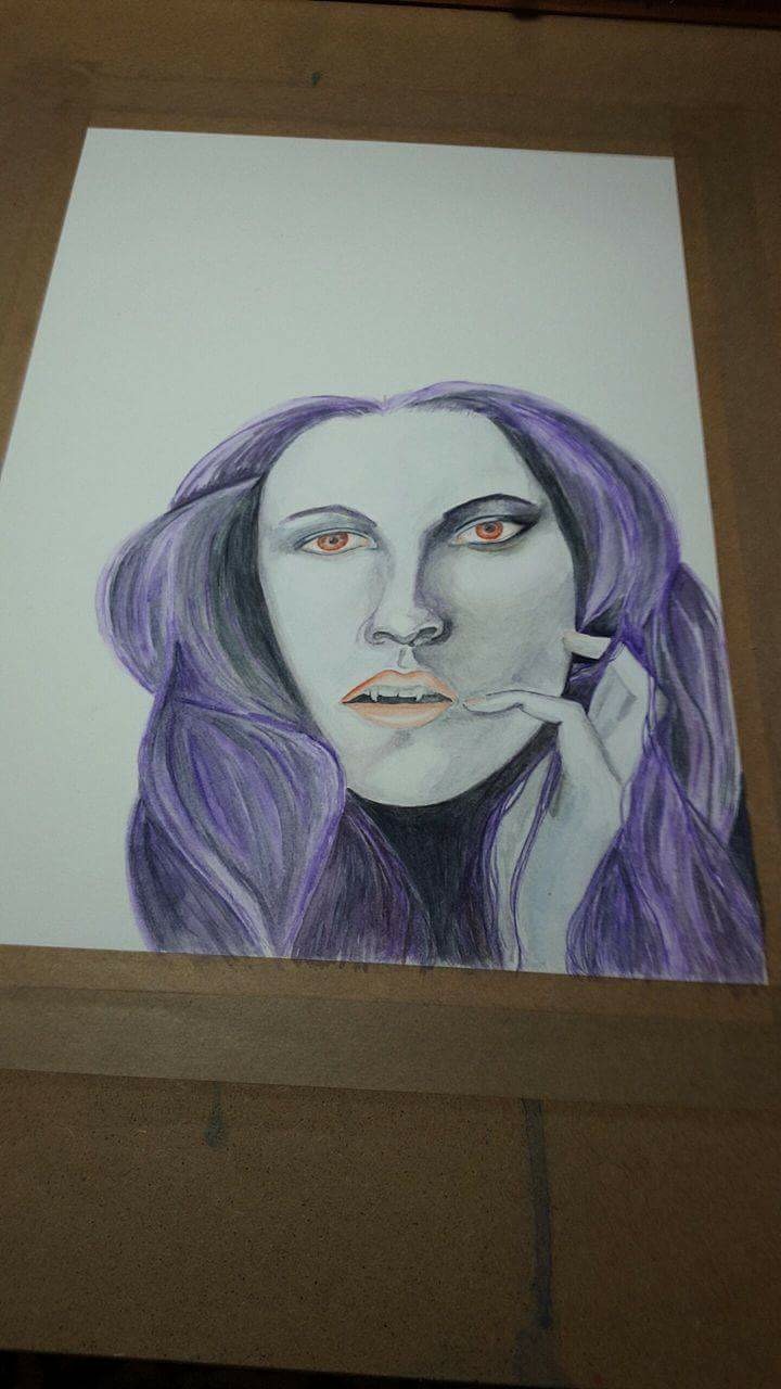
It is a question I hear a lot. Well, you are in luck as I have just finished a watercolour portrait for Halloween. I have filmed the process so I know exactly how long I took to paint it. I am going to share that process and information with you today. The painting took me 6 hours including the initial sketch and time it took to transfer the sketch. If you would prefer to watch the process scroll to the end where you will find a timelapse video to watch.
I started with the sketch. In my sketch book which I then transferred onto Watercolour paper. I do this because, if I make mistakes and rub out my pencil lines etc this can damage the good paper. So I do all my sketching and mistakes on my sketch book first. Then trace the finished sketch and transfer it to the 140lb hotpress watercolour paper. I then Sat at my desk put on some inspiring music(without words as I have a tendency to sing otherwise lol)
This is what the painting looked like after the first hour of painting.
After I took a short break it was back to work. The following picture was taken after a further one hour of work. So you can see it is not a fast process at all.
After taking another short break it was back to work again. This time I managed to get her eyes done and some more definition that is not that noticeable in this picture but it is there and took a further hour to do.
Finally after another short break and hour of painting I finally got to a point I was reasonably happy with the face and was able to move onto the background.
I worked a further hour and a half to finish and define the details on my vampire portrait under the full moon. For those of you who haven't worked it out yet that meant that it took me about 30 minutes for the sketch and transfer of the image. So adds up to 6 hours from start to finish. I hope you have enjoyed learning about the reality of how long it actually takes to paint a picture.
Back in May 2016, I lead an art collaboration on YouTube. We as a group of artists made bedtime stories on video using our art skills. It was a whole heap of fun to do. Here is how I made the book. If you prefer not to read the instructions there is a video available if you scroll to the end of this post.
This is a list of materials I used, you can use what ever alternatives you want to.
Media paper by Daler Rowney
Faber-Castell Pitt artist pen (black sx)
masking tape (good sticky tape)
metal ruler
craft knife
Scissors
HB lead pencil by Staedler
Eraser
Windsor and Newton cotman watercolour travel set
round size 10, 6 and 4 graduate brushes by Daler Rowney
First I drafted a story outline so I had an idea how many pages I needed and what characters I needed to draw. I used single sheets of paper to draw all my characters as seen here......
I then constructed the book (trimming off the rough edges before I did so) using masking tape so it could be drawn and painted over if needed. I would place the masking tape over the edge of one page, leaving at least half the width of the masking tape exposed to stick onto a second page. This stuck the first two pages together and the masking tape became the centre fold. So the pages were stuck well together and so there was no sticky parts of the masking tape exposed to stick I taped both sides of the join. It becomes a little more complicated to explain by words now but I will do my best and hopefully with the add of the photographs it will make it clear what I did. Alternatively you can watch the video to see exactly how I did this part. So for the next add of a page. I closed the first two pages as you would a book and stuck the masking tape to the back of the edge leaving half the tape exposed. Then placed the next page on top of where it would be if it was a page in a book (in other words it was three pages on top of each other facing the right way) and brought the masking tape up and over the pages. This then gave me the hinge/fold to open the page as if I was turning the page and stick the masking tape down the middle. I repeated this step until there were no pages to add.
tape facing down on the back right side flip page over
place next page down bring tape (sticky side up) up and over to stick on next page
flip over and tape down the middle
do the same with all pages until you have something that looks like this
next I drew round the characters in permanent pen, that way I could use watercolour paints to colour all my characters
once the characters were all coloured in, I then hand wrote my story in pencil first to make sure it fitted the page well and then used my permanent ink pen again to write over the pencil and erased all pencil lines, including the guidelines I drew to ensure I wrote my words in a straight line.
I knew my story featured a little girl in a garden crying and her pets all approaching her one by one to ask why she was crying and try to comfort her. To draw and paint the little girl on every page would have been many hours of work so I came up with a cunning plan. I decided to have a tip out pagethat featured the girl and every time I turned the page a new character was beside the girl. This tip out page was added the same way as the other pages only on the left side this time. As you can see in the following photo.....
To watch the full how to make a story book video click on the video below:
I hope this blog post has been helpful. I certainly enjoyed making this project and hope to do more in the future. If you have any questions or thoughts please leave me a comment below. I would love to hear from you. Maybe you have a suggestion of what my next project should be. If you do not want to miss out on future blog posts why not subscribe to my blog, so you know when the next post is available. Have a great day until next time bye for now. T x
How do you let go of the need for perfection? After doing so many faces and many of them I was attempting to get life like I became a little focused on perfecting my art work. I decided I needed to let go of my need for perfection. So here is how I did it. By playing with the concept of abstract in my art journal so I did not need to worry about perfection. In life not just art,it is very easy to get bogged down in needing what we do to be "just right". Even the reason behind me making this video brought out my inner critic. As this video was for a YouTube collaboration with other artists, my inner critic was telling me that I had to do a really good bit of art to not look out of place in this group of artists. For some reason my inner critic (we all have one) was telling me that in order to be noticed/liked/succeed in this collaboration what I did had to be "amazing" Sound familiar???. So when I noticed my inner critic was telling me my art is not good enough if it is not perfect, it was time for me to silence it, to let go and just have some fun. For me that meant ignoring my inner critic, not thinking too much about what colours I used, or what brush stroke I used, or even whether or not I blended the paint in, worked a treat. This journal page is beginner friendly so why don't you watch how I did it and try for yourself.
This is a very short post today. If what I have said today resinates for you why not leave me a message, we can chat some more about it. You can tell me your thoughts on the matter or ask any question you have. Either way it would be nice to hear from you all. Although this video is part of a video hop, it does show how I let go of my need for perfection, if you feel like this is too fast and you would like a slower more in depth version please let me know. I hope you take a peek at the video, checking out all the other video hop artists is optional, though I will say it can be fun. If you have any questions just ask. Take care T x
Hi folks in todays post are my final pictures for the 29 faces. As a couple of the faces have been influenced by Jane Davenport, who I discovered online, I talk a little bit about her influence on me, including my opinion of her book Beautiful Faces. If you have any questions please ask in the comments below. If you are someone who has also been influenced by Jane Davenport, I would love to hear about it in the comments. I am also interested in any other influences others have in the world of creativity, why not share who influences you in the comments.
I have been taking part in the 29 faces art challenge which finished on 29th September. Here are the final 4 faces I have completed for this challenge.
"let go of perfection"
ink and alcohol markers
watercolour and prismacolor pencil
prismacolor pencil
The last 2 faces were a follow these instructions activity contained with in the Jane Davenport book Beautiful Faces. As seen here on my desk.
I bought this book about a year ago on Amazon. I dip in and out of it whenever I need a little boost to my creative mojo. You may have heard that it is "bad" to copy. Well, of course there are copyright rules and you would want to follow these. This is a large topic and I will not be going into the details right now. Essentially, you are not allowed to reproduce another persons work without permission, whether that be art or photographs or even writing. You might now be asking how do I find a reference to draw from. Well the solution is to either take your own photographs or you can always go to paint my photo and find a reference photo there. For the purpose of my post today the book invites you to follow the instructions so I would like to thank Jane Davenport and her book for giving me the instructions and inspiring me to produce work that is not an exact copy but is clearly influenced by her work.
This book has an information section and activity on pretty much all types of media known. There are clear instructions on how to draw a face at any angle and focuses in on each of the individual features of a face. Although the style of art in this book is primarily whimsical, there is also some instruction on what a realistic face proportions are. It is a very good book and I would highly recommend it to anyone who is interested in drawing and painting faces, particularly whimsical faces.
The book has not been the only influence. I first found Jane on YouTube where she has a number of art lesson videos. These are a great introduction to the media she is demonstrating. The downside is to learn more you need to buy her art classes. The only classes I have experienced so far are the classes Jane has done for Lifebook2016 ( by Willowing arts) These lessons were such an inspiration I just got out my supplies and began arting along. Not all classes do this for me. Taking more of her classes is on my to do list.
Thank you for visiting. I would love to hear what your influences are, so why not leave me a comment.
I have been thinking a lot about how to come up with good ideas to draw/paint. I am finding it harder to come up with new ideas to keep up with the demand of a face a day for 29 days. I would be very interested in what you do to help keep your work fresh and interesting? Please share in the comments. Here is what I did. I have a cute basket full of a variety of colours and do not use them very often so decided to do some art work using them before they dry out. This was my way of kickstarting my artistic flow. I revisited a medium I have not used for a while and gave it a twist by using a pen to sketch rather than a pencil I could rub out. Unfortunately I was too late for some of my markers as I had to throw out 3 pens out due to them being dry and not working :( I guess that's what happens when you neglect alcohol pens. (another good reason not to keep your good art supplies for special work only and to use when the fancy takes) I did have the markers for at least 6 years, maybe longer, I originally bought them for colouring stamped images for making cards. First I started with a faber castel pitt pen xs to draw the faces then used the alcohol markers, I kept the pictures sketchy as I've heard Jane Davenport say on many occasion, anything can be forgiven in a sketch. Jane has been a positive influence on my art work and can be found at her website janedavenport.com/ I am beginning to see what Jane means. I do enjoy just going with the flow and not sketching in pencil first. I just trust the marks I make on the paper and just go with what I have and accept my marks and make something of them. Rather than worry about them. I have so many other projects on the go right now I needed to come up with ideas that were not going to take me more than say half an hour to do. Revisiting something I have not done for a while was something that work for me on this occasion. I do have other ways, perhaps I can share them with you another time. Here are the results, including a picture of my basket of alcohol markers at the end :)
Face number 23 and 24
Face number 25
a basket full of yummy markers used
Thank you for visiting and hope you will come back again soon. Take care T
GI was about to head to bed about 9pm when I was struck with the inspiration bug and so I just had to do some painting before I went to bed. Little did I know I would still be up at 1am in the morning, ooops. I am rather pleased with the outcome though, so maybe it was worth staying up just that little bit later to produce this lovely watercolour painting. What do you think?
Painted using prima watercolour (decadent pies)
You can always let me know what you think in the comments. Is art worth staying up for sometimes?
Hi folks and welcome to my blog post. I have fallen behind slightly again from my daily posts but I have a double treat for you as I have caught up on my faces today. Another two watercolour drip effect portraits. I am trying new ways and trying to find my style in there too. It is still a bit of a hit or miss but so far I have resisted the temptation to sketch first. I may try sketching next just to see how much of a difference it makes to my paintings. I have been trying to make these paintings as organic as I can, hence no initial sketch. But perhaps I can still get that organic feel even with an initial sketch even if it is to place certain markers of the face. So without further a do, here are my two faces.
I decided to use my decadent pies watercolours by prima then thought "oh the purple acrylic ink I have would look fab as her hair" So there you have it. I quite like this girl.
For this painting I thought I would try my hand at a male face with this technique, only it did not quite go according to plan but it certainly is a step in the right direction. I think I got too invested in making sure it looked like a male face and got too bogged down with trying to get in detail.
I hope you have enjoyed seeing my abstract exploration paintings as much as I have enjoyed painting them. Thank you, please come back soon T
Unfortunately my daily posting was interrupted by having to give into my cold. I decided the only way to get rid of it was to get to bed and rest up. Well I did that on Friday and Saturday and so by Sunday I was feeling a lot better and more able to art. I did a few catch up one after the other in the same style and medium. I love working with watercolour and thoroughly enjoyed working on my Jean-Luc Picard However, I have always fancied trying my hand at a little more abstract art. So I figured why not, "how hard can it be? Right?" Well, I can tell you it is not as easy as artists who produce fantastic work make it look.
This was the first painting, done on 'The Langton' hot pressed watercolour paper by Daler Rowney 140lbs 12"x 9" There was no pre sketching done it was totally out of my head and spontaneous. I wanted to experiment with dripping, it always looks so good on other artists work. I faffed about with this a fair bit and I felt I was still being a little precious with the detail. I needed to let loose. So I tried again .................
This one I switched to bigger paper as I figured it might help me to just "let Go" and try big bold brush strokes. I used 'The Langton' hot pressed paper 140lbs 16"x 12" again by Daler Rowney and just went for it. I liked the overall outcome, yes I can still improve but I was beginning to really enjoy this process/style of working. Of course the downside is I now want to purchase more watercolours lol oops
As I felt more confident I had a thought in my head, an image of a painting I wanted to do so I attempted it. I say attempted it as it really did not quite work out how it was in my head but then as artists do we ever get that? This is what I got instead........
Again like all the other paintings I did not start with a pre sketch. It was painted on the same type and size paper as the previous painting. I actually do think it is a fair representative of what I wanted it to look like and it covers two faces so lets me catch up with 29 faces (woohoo). I am just not sure about this one being display worthy. I feel I have kinda messed up the eye area of the male face I was trying to hint at an eye and ended up with the darker area in the wrong bit so tried to fix and just made a mess. Also as a kiss it is not as sensual as I wanted it to look. At least that's what is in my head, that is what I see. So what do you see? I would be interested to find out others opinions of this very raw painting.
oh I nearly forgot to say, all paintings were done using Windsor & Newton 12 half pans travel set with graduate round size 10 brush and System 3 round size 6 both brushes by Daler Rowney
Anyway Thank you for stopping by and checking out my blog :) Have a good day/evening bye for now T x
Welcome all, I am now past the half way point to this 29 faces challenge. Today I am pleased to present my 15th Face which covers both the 29 Faces Challenge and this months #CACFanArt event. Scroll down to the link at the end of this post, if you are interested in seeing my process video. Otherwise continue reading for the process in pictures.
I started off with a sketch of Jean-Luc Picard on 12"x 9" hot pressed watercolour paper 140lb by Daler Rowney (The Langton)
Using a round system3 size 6 brush and Windsor & Newton travel watercolour palet I begin to add the colour. I know with watercolour you are suppose to go from light to dark but I sometimes like to add my dark in first and graduate it out.
Looking a little strange stage for sure lol
starting to look a little more lifelike but there is still something missing
The eyes in my opinion really bring life to a painting.
Adding the finishing touches
There you have it...... the finished painting.
Thank you for stopping by, click on the video link below to view the painting process.
Today has been another day of a stuffy nose and head feeling like it has been put in a car crusher :( So unfortunately I have not got done what I planned. So I thought it might be fun to find an old face I drew when I was at school.
I was 12 when I drew this self portrait and that was not yesterday lol
Thanks for stopping by and hope you come back again. I have a rather special face post planned for tomorrow :) T x
Well today I am still not feeling very well. I have a bit of a cold so, have to admit I am feeling a little sorry for myself today. So for my face I have just been messing about with one colour of my polychromos pencils. I hope the camera has picked up well enough on the photo.
Hopefully I will feel a little better tomorrow and normal service will resume lol Thank you for stopping by. See you all again soon. T x
Well, here I am on day 12. Despite a few delays I am almost at the halfway point woohoo. I really was not sure I could even get to here, what with all the other things going on in my life and projects on the go. And today has been no different. I do have a face to share but I have also been moving furniture around in my art studio to try to make my space a little more inspiring. I moved into my new house in June and have not really focused so much on my art space. Well today it was my studios turn.......
that point when you think "why did I start this again?" lol
It is starting to look a little more worth the effort.
It is still not quite finished but I decided I would stop and take a break, so I could come online and post in my blog. And share with you the face I quickly sketched for day 12 of the 29 faces challenge.
I was attempting to be more loose and going for that artistic effortless sketchy look.
So there you have it a little glimpse into my day 12 efforts. Thank you for stopping by. I plan to do a full studio tour once I have it looking more inspirational rather than just a room with furniture dumped in it lol. So watch this space for that. Thank you for stopping by. Have a good day. T x
Hi folks, I am thinking even I have outdone myself this time and it will be difficult to top todays offering. I have managed to do three faces in one project and reviewed 3 types of pencils in the process, Polychromos, Prismacolor and Spectrum Noir. First will be a written explanation of my drawings and if you continue to scroll down you will find a video if you would rather watch my demonstration.
This first sketch is using prismacolor. The camera has not picked up the sketch very well (sorry) Although it is difficult to see in the photograph (this happens with all pencil sketches) I am happy to report that using this pencil to sketch was a joy. It was very smooth. When I was sketching with a light touch it laid down light pigment increasing in intensity when pressure increased.
Next I sketched with polychromos (by faber castell). The second face is a little more difficult to see but this is more to do with the different colour I chose to sketch with. For demonstration purposes in the future I will be more careful what colour I use. However, again, like the prismacolor, these pencils are a joy to sketch with. They allow for lighter touches increasing in intensity of colour the harder you press down on the paper.
The third sketch, which is even more difficult to see, is spectrum noir. Even allowing for it being a different colour I used from the Prismacolor and polychromos sketch, it is definitely the lightest pigmented pencil. I found it usable to sketch with.
Colouring with prismacolor pencils I found really a really good experience. This is only the second drawing I have done with my new purchase. The colour is highly pigmented and went onto the paper very well. The colours layer well.
Colouring with the polychromos was, as it always is, a joy. The pencils lay down colour very well as with the prismacolor. The polychromos also layer well. I had to use raw umber helioblue and Mauve to create the dark colour for her pupils as I do not own a black polychromos pencil.
Colouring with the spectrum noir required a little more work to lay the colour down. However over all they performed well and I am sure you agree the end result is pleasant enough. The colours are definitely lighter and they layer to a point but not as well as the prismacolor or polychromos pencils.
All in all I could not really ""fault" any of the pencils from this project. The spectrum noir require a little more work to get a good result but you can get a good result. They are the slightly cheaper pencil so it maybe more cost effective for someone on a lower budget. For me personally I prefer the prismacolor and polychromos over the spectrum noir. I cannot based on todays picture seperate my two favourites. However, perhaps in time I will find I gravitate towards one or the other.
I hope you have found this useful and have enjoyed these particular faces for the 29 faces challenge. I must ask the organiser Ayala arts if this counts as another 3 of my 29 faces rather than just one lol I do plan to do a more indepth swatch type review of all the pencils in the future so watch out for that one. If you have any suggestions of what you would like to see me demonstrate next, or questions, why not put it in the comments below and I will do my best to answer them. Thank you till next time T x
Good morning from Scotland. It is 10.32am as I type this post. I have woken up and had my breakfast in the knowledge that I have already worked on todays face. For once I am not playing catch up. Yesterday as I said in my previous post I was waiting on a parcel. This parcel was a pack of 72 prismacolor pencils. Of course I really wanted to try them right away lol Well by the time I got round to having time to use them it was late at night so I had a bit of a drawing session in bed before going to sleep around 2am, oooops, so a little tired today but so worth it.
This is not a drawing that fully tests my new pencils. It was late when I drew this face, that's my excuse and I am sticking to it lol. It was drawn initially in one of the many grey shades then I added a little colour to the eyes and the lips. The only colour used on the face was a little lilac/purple in the shading. The rest is a couple of grey shades. The drawing is not fully complete but I like her just the way she is, so I will probably leave her as is. I do want to put all my pencils through their paces though, so watch this space for a review of all the pencils I own, which are now prismacolor, polychromos and spectrum noir. That should be an interesting testing session :) Thanks for stopping by hope you come back again sometime soon T x